In this simple guide, we will teach you how you can achieve the cardboard paper effect in business cards. It is fairly easy to do, and one does not really have to be precise with the tools needed to achieve this memorable effect for business cards. For our tutorial, we will be using Adobe Photoshop as the primary tool in the design, but do not worry, you do not have to be a professional to follow along. Even amateurs can easily follow what we will be doing. So let us start.
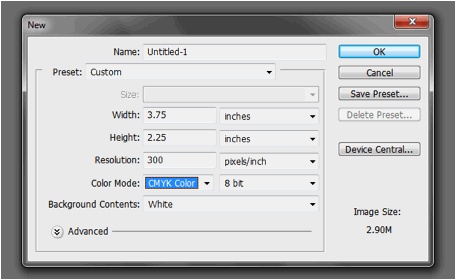
1. Upon creating a new document in Adobe Photoshop, make sure you setup the dimensions required when printing business cards. A typical business card dimensions is around 2.25×3.75 inches. However, the local business card printer might specify otherwise so make sure you ask the ideal dimension. It will be best as well to set a resolution of 300ppi for a good quality print.
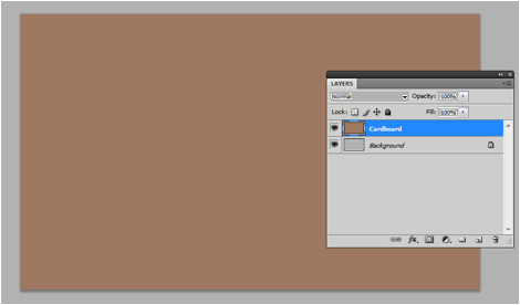
2. With the new document open, let us begin processing our background. First things first, let us create a new layer by pressing CTRL+SHIFT+N and name this cardboard. Fill our cardboard layer with a cardboard color. Here we are using #ad8b74.
3. Next, create a new layer by using the same technique above. Press letter D and letter X on the keyboard to bring the foreground and background colors to white and black respectively. Go to Filter -> Render -> Clouds. Once you see the clouds, change the blend mode of the layer to overlay and reduce its opacity to 50%. This gives us some variation in the color.

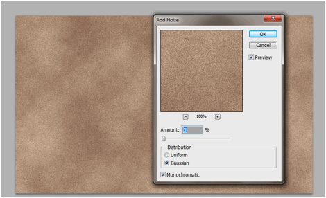
4. Merge this layer with our cardboard layer by selecting both of them on the layers panel (hold shift and click) and then right clicking on them. On the context menu that appears select “merge layers”. Once done, go to Filter -> Noise -> Add Noise. Use the settings below to add some extra noise to our texture.
a. Amount: 5%
b. Distribution: Gaussian
c. Monochromatic: Checked
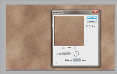
5. Finally, we go to Filter -> Blur -> Motion Blur. This filter helps us simulate the horizontal texture elements of the cardboard. Just use the settings below for the filter.
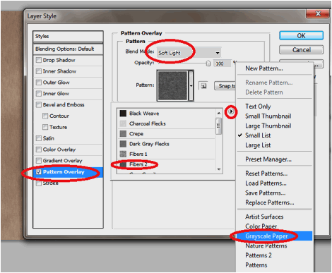
6. We are not finished yet with the texture processing. Now, double click on our texture layer to bring up the layer styles window. The first option we will activate is the Pattern Overlay. Set its blend mode to soft light. Change the pattern by clicking on the down arrow at the right of the box. In the options, click on the right arrow icon and choose “Grayscale paper”. Select the fibers2 option.
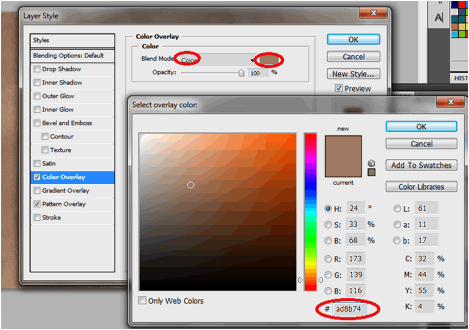
7. Next, we click on Color Overlay. We change the blend mode to ÒColorÓ and change the color to our original background color. This helps us maintain our theme color for all the other effects.
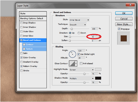
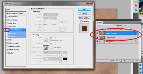
8. Finally, click on bevel and emboss and use a value of 1 pixel in the size. Leave the rest to default.
9. To add a more three dimensional effect, duplicate our layer two times by pressing CTRL+J two times. Nudge the top duplicate 2 times upwards and 2 times leftwards. Nudge the lower duplicate 1 time upwards and 1 time leftwards. This will add a shadow and 3D effect at the bottom right sides of our design.
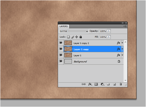
10. Finally, merge the two layers at the bottom my selecting them both, right clicking on them and selecting merge layers in the context menu. Afterwards, clear the bevel layer of the top card layer by double clicking on it and unchecking the bevel and emboss effect.
11. Create another new layer. Bring this layer on top. Then, using a splatter brush or a grunge brush, add some splatter color variations in the texture design. Make sure to use a darker color version of your background and reduce the opacity of this layer to 40%.
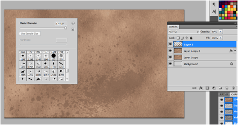
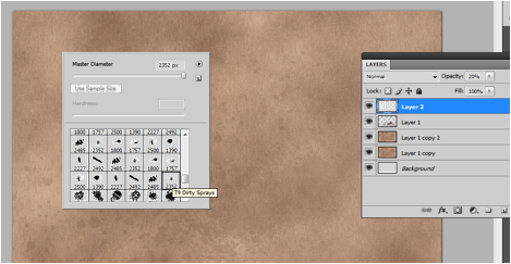
12. Repeat the process again. This time use a white color grunge or splatter brush. Reduce the opacity by 20%.
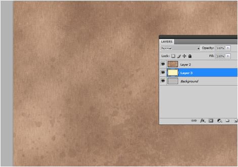
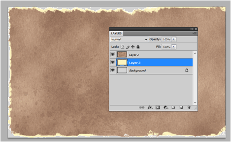
13. Great! Now we shall simulate the torn effect. We do this by simply using the eraser tool. First merge all your cardboard color layers into one by selecting ALL of them and pressing CTR+E. Next create a new layer just below this layer. Fill this up with a very light brown/yellow theme color.
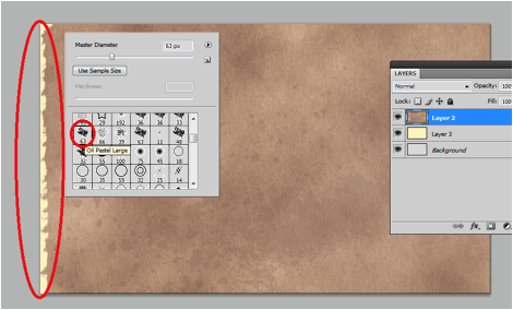
14. Then start doing some torn of erasures by selecting the merged layer and then erasing the edges. Make sure you use the brush “Oil Pastel Large” for our eraser tool to get a better torn effect. Do this for most of the sides of your business card. (leave one or two areas alone)
15. Repeat the process for the lower yellow layer, but make sure that you do not erase it too much. Make sure it is visible still just behind the main cardboard layer. This adds a second layer to the torn off effect.
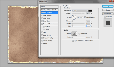
16. Double click on the yellow layer and add a drop shadow layer style. Use only a 1 distance and a 3 pixel size for the shadow.
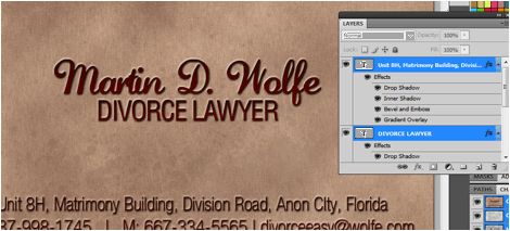
17. Now, you can add your text for the business card. Just use the type tool and choose a good font color and font style.
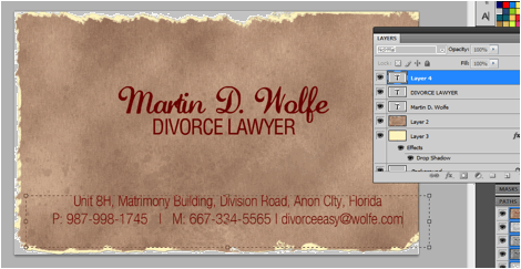
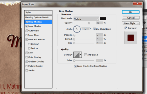
18. You can add some extra effects to your text by playing with its layer styles. For our example we apply four layers styles. The first is the drop shadow. Use a distance of 1 and a size of 0.
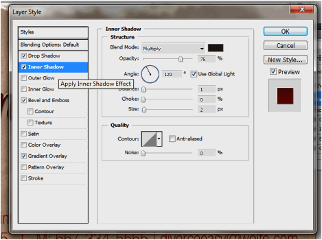
19. Next, select the inner shadow option and use a distance of 1 and a size of 2.
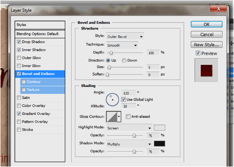
20. Then, click on Bevel and Emboss. Use an outer bevel style with the rest of the options in default.
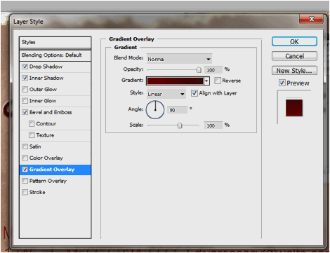
21. Finally, add a gradient overlay. Use colors that match your theme for the gradient.
22. That should give you this nice effect. Apply it to all the text in your business card.
23. Once you are happy with your text, your cardboard style and torn paper business card design is done! Congratulations!


5 Responses
Cool tutorial! Thanks for sharing )
Auspicious tutorial, its such a good defined learning resource.THUMBS UP!! Template Design
Such a creative thinking, I love this tutorial and know how to explore a common think into creativity.
wow..it’s an awesome tutorial. i like it. thank you for sharing with me. your blog is very useful.
WWOOOWW !!! coooooll….should have prepared an action file out of it !! hehehe….:p
Comments are closed.