In this tutorial I will teach you how to edit in photo in Lightroom and Photoshop to dramatically alter its appearance and mood. We’ll change a broad daylight scene into a night-time one, lit by a street lamp. I’ll also take the opportunity to describe some non-destructive editing techniques in Photoshop.
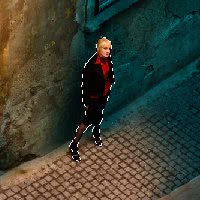
Below you can see the ‘before’ and ‘after’:
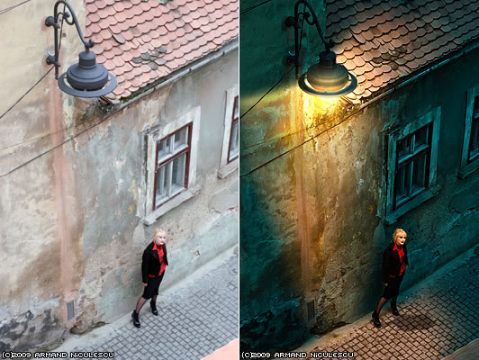
The original, straight from the camera image is mind-numbingly dull; it’s the very definition of dullness. It was shot in a overcast February afternoon. As boring as it is, it was perfect for my purposes. I wanted to convey a sense of ‘out of place’, of a person that doesn’t really belong there, forcing the viewer to create a story – who is this young and attractive woman and what is she doing in this miserable street?
The overcast day had the advantage of decreased contrast and a complete lack of shadows, allowing me a wide range of editing.
Creating the light/dark versions
First thing, I created two Virtual Copies in Lightroom:

Original, with default contrast. Slightly overexposed too.

The “lit” version, Contrast was set to 100, also Clarity was was to max, increased vibrance. White Balance was set to Cloudy

The “unlit” version. The image was underexposed by 2 stops. White Balance was set to Tungsten.
As you can see above, the altered versions are already better — especially the “night” one, dark and moody. However, the street lamp gave me the opportunity to go the extra mile in creating something realistic.
Mixing light and dark
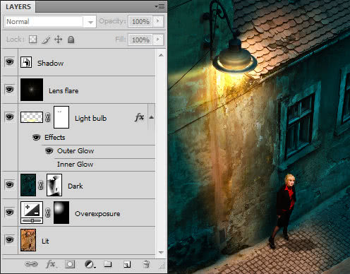
Having exported the two versions as 16bit TIFF (for maximum quality), I opened both of them in Photoshop. I then copied the “dark” one and pasted as a layer over the “lit” version.
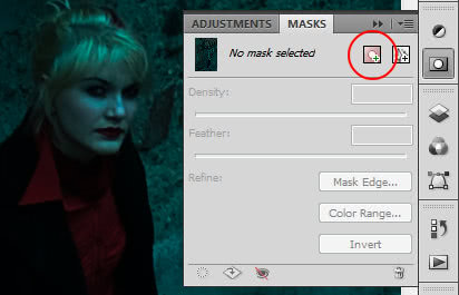
It was pretty clear already that quite a lot of trial-and-error was to be expected, so instead of simply using the Eraser to remove parts of the “dark” layer, I decided to use a mask instead.
I selected the Dark layer and from the Masks panel, I clicked on the Pixel Mask button to create a new mask.
A Pixel Mask works just like an alpha channel for the layer – it’s a grayscale bitmap where white is opaque and black is completely transparent. What’s cool about it is that you can alter the opacity of the layer by painting on the mask.
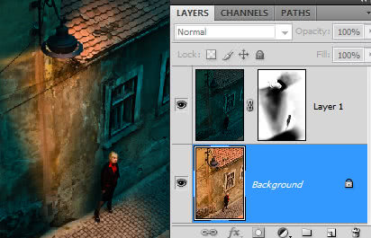
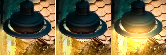
You can see on the left how the mask affects the mix between lit and unlit areas.
I clicked on the mask in the Layers panel to select it and then I simply used a semi-transparent, highly feathered black brush to create transparent areas.
There are three main lit areas: the light on the wall, faing out, the light on the pavement the light spill on the roof. You can notice that I preferred to paint everything instead of using gradients, to avoid the artificial “perfect” look.
Adjusting the exposure
The light was still too even in the lit area; close the the light source I needed something much more powerful (remember that light falls off exponentially). To improve the realism, I added an Adjustment Layer just above the Lit layer.
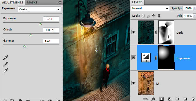
The Adjustment Layer was set to Exposure (Layer –> New Adjustment Layer –> Exposure). I added a simple radial gradient as a mask for this layer the same way as previously and then I tweaked it to get a slightly overexposed look.
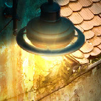
Adding the glow
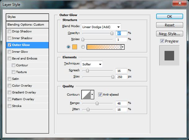
By now I had the light on the wall and pavement pretty much in place; it was time to turn to the light bulb. For this, I simply used the Lasso tool to select the visible area of the bulb and then copied and pasted it as new layer. I then used the Curves to make the bulb much brighter. Finally, from Layer –> Layer Style –> Outer Glow I created a nice amber glow around the bulb.
Below you can see the exact settings for the glow:
I still wanted to add some nice touches: the glow should not be that strong in the upper area. Can you guess what I used? Yep, another Layer Mask.
Please note: By default, layer masks do not affect the layer effects. To make a layer mask hide the effect, open the Layer Style window and go to Blending Options section. From there, check the “Layer mask hides effects” option.
In the layer mask, I painted in black the areas I wanted the glow to be weak. Below you can see the result:
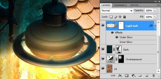
As you can see, I did not eliminate the glow completely, but created a glow-behind-the-edges effect that is seen in high-contrast situations.
Lens flare
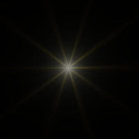
Most designers, upon hearing the words “lens flare” run away screaming. They are very often overused and cheesy. Even the new JJ Abrams’ Star Trek features some lens flares annoying as hell. Still, they an unavoidable part of photography and can add some realism if used wisely.
Unfortunately, Photoshop’s Lens Flare effect is laughable. I think it’s the same effect as 15 years ago. I only know of two decent lens effects – one in the old plugin Kai Power Tools 6, the other is Corel Photo-Paint. Both of them allow you to control the size, glow, ring, stars, streaks and reflection trail. This is not a tutorial on lens flares, but modern, good lenses don’t create reflection trails, but only a nice star pattern with minimal interference or random streaks.
For this photo I created a very simple star pattern on black background and I put it as a layer with blending mode set to Linear Dodge (Add) at 33% opacity. You can see that the effect is barely there; its purpose is to enhance the scene in a minimal way, not to overpower it.
Shadows
If you recall from the beginning of this tutorial, the original image had no shadows because of the overcast sky. Now, as I created a light source, I needed to create a shadow too.
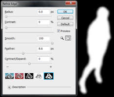
With the background layer active, I started to make a simple selection on the girl using the Magnetic Lasso. I didn’t even needed to be very careful, but just to follow the contours.
Once this was done, I clicked on Refine Edge and increased Smoothness and Feathering. After that, I created a new layer and filled the inside of the selection with black.
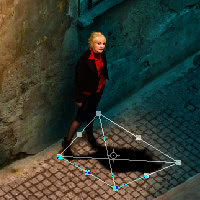
The next step was to convert the new layer into a Smart Object via Layer –> Smart Objects –> Convert to Smart Object. Why? It’s because a smart object’s original appearance is preserved so I could distort it any way I wanted without degrading its appearance on each step.
Finally, I set the layer’s blending to Multiply and its opacity down to 50%.
Final result
Here’s the final view with all the layers:


48 Responses
beautiful,amazing.
Thank you for this tutorial. A very creative way to add to my existing library of images. Rock on!
Armand,
Very good. My only comment would be that the light pattern on the wall is questionable as light disperses more as it gets further from the source, whereas yours converges toward the ground.
Other than that, I’m going to give it a go. Thanks for posting the technique.
Regards,
Gordon
You’re right – it wasn’t in my intention to make it convergent, obviously, but I also did not make it fully realistic. I concentrated on the mood. The beauty of the non-destructive editing is that it’s very easy for to alter the light pattern, so I can keep playing with it.
This is way cool!!! I am super impressed…maybe I will get brave enough to attempt this myself! I love it…thanks for the tutorial!
That is really awesome! Thanks for sharing!
Very nice… Well done
Really well documented thank you. Will give it a plug in TipSquirrel’s Nut Cluster Podcast.
Thank you so much! It means a lot to me.
good day i loved your work I want to make same pic you did
but i want to know the first step you did using the light room
i want to know the dimension that you used in making the lit version of the pic
and the dark one.
i did as you said but there is something missing in not look exactly as yours in the lit version and the dark one
will you please provide me with the exact dimensions that you used to adjust the pics in the lightroom.
i will be thankful
regards
Excellent tuorial which I will use……..
Thanks for taking the time to write and publish….excellent.
Best wishes and thanks
Ray
Fantastic tutorial. Thank you for your generosity in sharing this technique as well as taking the time to show your settings and how you did everything. This is above and beyond what most people do these days. Thanks!
wow… this is amazing… was just thinking of doing the same thing to a mall… ^_^ this will probably help me a lot..! thnx for sharing…
Fantastic Work brother Thanks Again For The tutorial
WoW! How great is this! It demonstrates just how much I don’t know about the photoshop world. Its like a grammer school to graduate school comparison! Thanks for sharing. One day when I grow up. . . . 🙂
Thank you for you
many thanks armand
Mulsumesc!
cool..
=)
izalazli.blogspot.com
WOO… greatfull.. bro
mantap..cool..:)
Very nice!!!
Hello,
this is a very good workshop. Let’s make the world in gray more colorful 😉
Best regards
Kasi
Do you have to start out in Lightroom? I don’t have it, but would love to try this project
No, you don’t have to use Lightroom. You can use Adobe Camera Raw from Photoshop to alter white balance. Good luck!
Thank you so much!!
Please note that I’ll be on vacation for a week. Any comments/questions you submit will be published upon my return.
fantastico!grazie per i suggerimenti preziosissimi!
fantastico… grazie per i suggerimenti! siete mitici!!!
its really goood lesson
muy buen montaje, pero la sombra esta hechada demasiado al frente de la modelo, debio recostarse mas a la izquierda de la misma y más cenital, porque al parecer figura como si la luz viniese atras de ella, muy buen tratamiento.
so nice….
Creative thanx
https://www.facebook.com/Aln.A.Elia?ref=profile
Just wanted to say that is one AWESOME tutorial! To be honest, I thought it looked very daunting, but seeing that it’s basically WB adjustments! That’s just pure genius! Totally something I could try my hand at! I will be on the lookout for images that fit this kind of project!
Thank you for taking the time to do this!
cool tutorial, could maybe be useful for cemeteries?
Very cool and so easy to follow – I gotta try this sometime 😀
Exactly what I was looking for. Didn’t know Lightrooom had these features. Gonna give it a shot and hopefully good use for my current project.
good day i loved your work I want to make same pic you did
but i want to know the first step you did using the light room
i want to know the dimension that you used in making the lit version of the pic
and the dark one.
i did as you said but there is something missing in not look exactly as yours in the lit version and the dark one
will you please provide me with the exact dimensions that you used to adjust the pics in the lightroom.
i will be thankful
regards
Unfortunately there are no exact values to give you, it depends on your scene. I mentioned in the article (in the caption underneath the second image) that the White Balance for the “day” pic was set to Cloudy and the WB for “night” pic was set to Tungsten. You may want to play a little with the WB/tint sliders and see what effect you like best.
incredible!!!!!!!!
great tutorial and very realistic result!
I found this tutorial from another “author” somewhere else: http://blogswizards.com/advanced-day-to-night-photoshop#disqus_thread
I assume, you are the author and they copied it?
Anyway: Thank you for the Tutorial, it helped me a lot!
Yes, indeed, the article was copied from Twin-Pixels without permission and without even giving proper credit. I contacted the author, let’s see if he makes it right. Thanks for the heads-up!
awesome tutorial. i aint got lightroom though. that sucks. anyway to achieve those results in step one in photoshop alone…
also i kinda feel cast shadow you created is placed incorrectly. in order for your shadow to be realistic the light source would need to be BEHIND her right shoulder (our left) some, though that would be impossible since shes up against a tall wall. the light source is in front of her body though. light would be hitting her front right side, so therefor a “cast” shadow should cast on her rear left side, on the ground directly below her some and mainly on the wall not on the floor in front of her, there would need to be a 2ndary light source that was much stronger behind her to do that… but like i said that would be impossible since shes up against a tall wall.
nice tutorial there thanks for sharing..
Awesome. Takes real artistry for someone to achieve this.
Fantastic tutorial, thanks for sharing, wish there is a video tutorial such as this….
continue to rock man!
Comments are closed.